Are Flemish energy scores manipulated for a better EPC label?
Following the 'Factcheckers' report on the Flemish broadcast channel VRT about the approach of some energy experts, Realo, in collaboration with the newspaper De Tijd, investigated whether there are systematic problems in the EPC scores assigned to Flemish houses.
The TV broadcast showed that significant differences can occur in the assessment of a house's energy efficiency, which affects the assigned energy label and thus the value of the property. In one specific house, four different assessments resulted in three different labels: an orange D label, which just exempted the house from Flemish renovation obligations, a better C label, and even a light green B label.
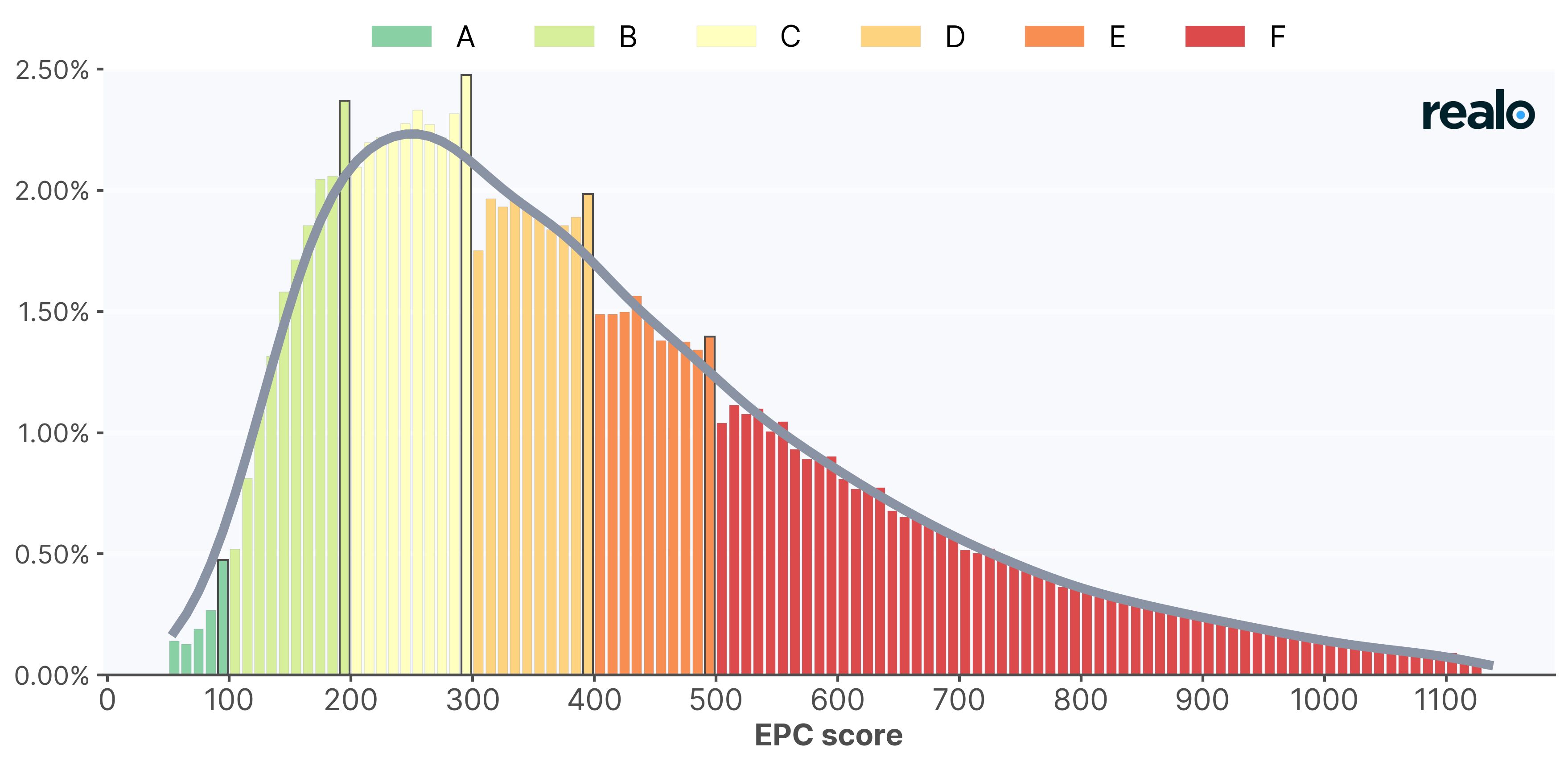
Since 2019, sellers have been required to mention a valid EPC certificate in their listing, giving Realo a comprehensive overview of the distribution of EPC scores in Flanders. Based on these figures, De Tijd calculated that the number of certificates with an energy score of 290 to 299 kWh/m² per year (equivalent to a C label in Flanders) is 15 percent higher than expected. Conversely, the number of certificates with a score between 300 and 309 kWh/m² (just below a C label) is almost 17 percent lower than predicted. At the threshold of a D label, we see a difference of +14.5 and -11 percent. A similar pattern is also visible with the much better B label. Earlier research by De Tijd, in collaboration with Realo, showed that the energy label is increasingly influencing the house price.
To clarify these figures a bit more, here is an illustration:
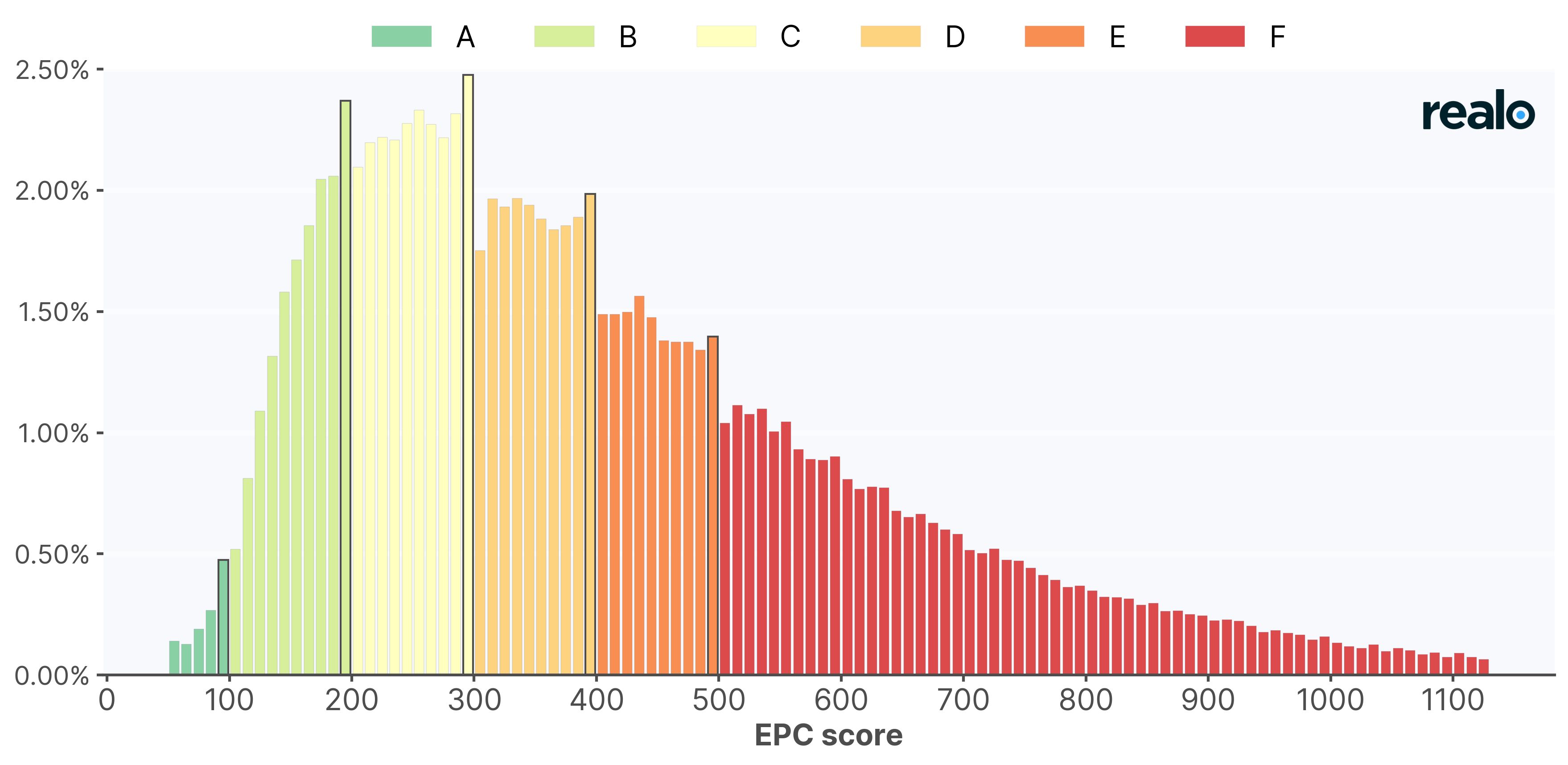
To understand how much the EPC scores deviate from what would occur in a normal situation, a distribution is simulated that shows no deviations:
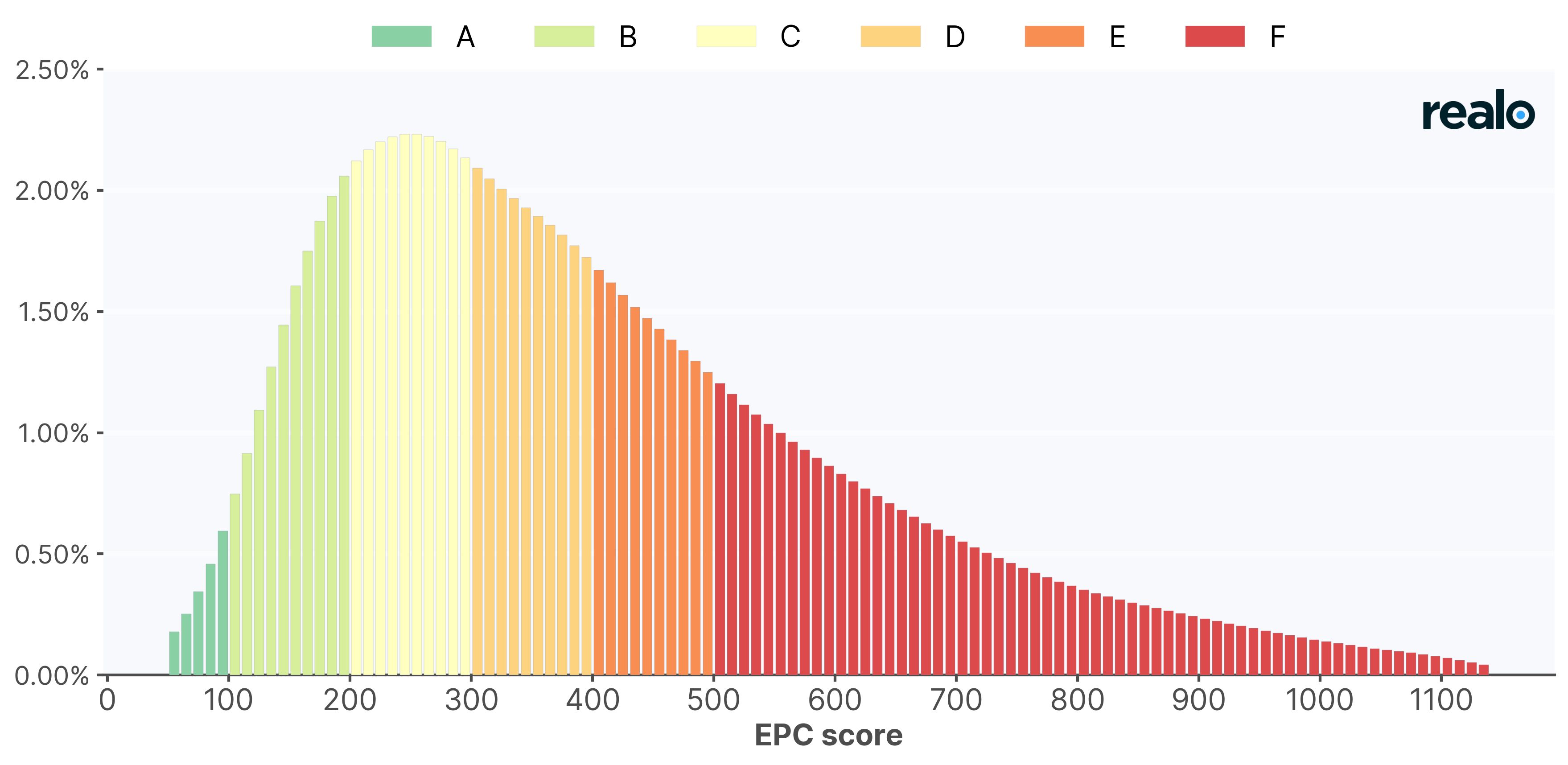
When we overlay the two distributions, the real situation and the simulated situation, it becomes even clearer that EPC scores around label thresholds do not follow the expected pattern, but occur much more frequently just below a label threshold and much less often just above a label threshold. In other words, there appears to be a systematic tendency to round down when EPC scores are close to a label threshold.